

Introduction
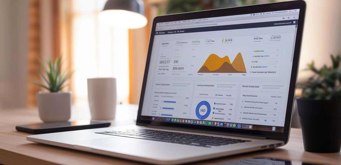
Let’s be honest—most dashboards feel like they were built for robots, not people.
You log in, and boom: a wall of numbers, graphs, and options you’re not even sure you need. If you’ve ever stared at a dashboard and thought, “What am I even looking at?”, you’re not alone.
That’s exactly what we don’t want your users to feel.
So if you’re working on a SaaS product and want your dashboard to be something users actually enjoy using—not just tolerate—here are some real, practical tips to get it right.
First, figure out what really matters to your users
Don’t start with widgets. Don’t start with charts. Start with this question:
“When a user opens the dashboard, what do they need to know right away?”
Maybe they want to check today’s sales. Or see if their team is falling behind on a project. Or get alerted if something’s off. Whatever it is, that core goal should drive your design.
Real tip: Talk to actual users. Watch them work. Find out what they care about most—and make that the hero of your dashboard.
Keep it scannable, not stressful
A good dashboard tells a story at a glance. If users need to think too much just to understand what’s happening, that’s a red flag.
Use simple language (no jargon like “LTV by cohort filter offset delta”).
Show summaries up top—details can come later.
Add icons or color cues to help people read quickly.
Think: “What’s going on?” → “Is everything okay?” → “What should I do next?”
Avoid feature overload
More charts ≠ better dashboard. In fact, too much information just leads to overwhelm.
Instead:
Only show what’s useful
Let users dig deeper if they want (expand, click, filter)
Don’t try to impress—try to help
Bad: 12 different KPIs fighting for attention
Good: 3–5 key insights that actually help users take action
Let users personalize (a little)

Not every user is the same. One might care about daily active users, another might focus on revenue trends. If you can, give them some control:
Rearranging widgets
Saving a custom layout
Hiding what they don’t need
But don’t overcomplicate it—make sure there’s a clean, default version that works for everyone.
Don’t forget about mobile

More people are checking dashboards on their phones than ever. If your dashboard breaks or becomes unreadable on a small screen, that’s a dealbreaker.
✔ Stack things vertically
✔ Use tap-friendly buttons
✔ Keep key info visible without zooming in
If you’ve never tried your own dashboard on a mobile phone, now’s the time.
Show empty states some love
Here’s a quick win: design for moments when there’s no data yet. Don’t leave users staring at a blank screen or a sad “0” chart.
Instead, use that space to:
Explain what will show up here
Suggest a next step (“Add your first item”)
Maybe even include a friendly illustration or tip
You’re guiding them, not leaving them hanging.
Real-time + next steps = gold

Dashboards aren’t just about showing what happened. They should also help users know what to do next.
Show real-time updates where it matters
Highlight trends, risks, or unusual patterns
Even better: suggest an action (“Send follow-up email now”)
The more proactive your dashboard feels, the more useful it becomes.
Keep improving (you won’t nail it the first time)
Your first version won’t be perfect. And that’s okay.
Watch how people use it. Where they get stuck. What they ignore. What they ask for.
Use heatmaps or session replays
Ask for feedback (short and sweet)
Update often—small improvements go a long way
Remember, a dashboard is a living thing. The best ones keep evolving with the product.
Conclusion: Design Less for Screens, More for People
At the end of the day, dashboards aren’t about data—they’re about decisions. If your SaaS dashboard can help users understand what’s happening, what matters most, and what to do next, you’re already ahead of most.
Great dashboards don’t overwhelm. They guide.
They don’t just show numbers. They tell a story.
And most importantly—they feel like they were made for real people, not just power users.
So, keep it simple, clear, and purposeful.
Because when users love your dashboard, they’re not just using your product—they’re relying on it.
Fineart Design Agency has helped leading SaaS companies craft intuitive, user-loved dashboards—blending clean design with real-world usability that keeps users coming back.
