

Introduction
A beautiful storefront means little if your visitors can’t find products, trust your checkout, or finish a purchase in two taps. E-commerce UX best practices focus on reducing friction at every stage—from discovery to delivery—so you can boost revenue without cranking ad spend. Below is a practical, jargon-free playbook you can implement and iterate on right away.
Prioritize Page-Load Speed
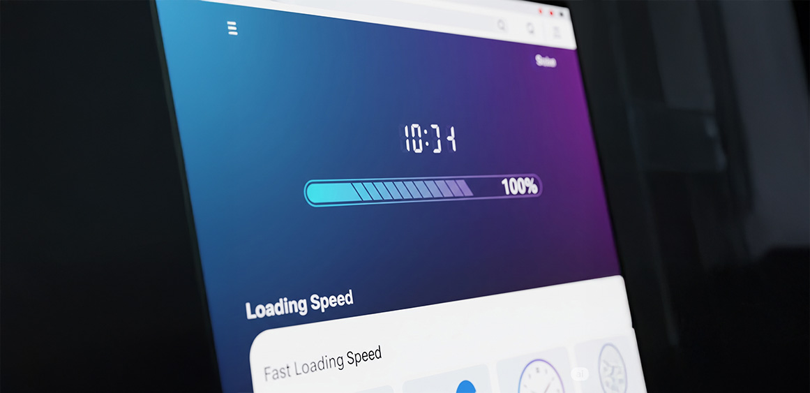
Why it matters: A 1-second delay can drop conversion rates by up to 7 %.
Quick wins:
Serve next-gen image formats (WebP/AVIF) and lazy-load below-the-fold assets.
Minify CSS/JS and use a content-delivery network (CDN).
Audit third-party scripts—remove what you don’t need.
Design for Thumbs First (Mobile UX)
Sticky “Add to Cart” bars keep CTAs visible while scrolling.
Thumb-reachable filters (lower half of the screen) reduce tap travel.
One-hand navigation: center key actions; avoid tiny icons in corners.
Keep Navigation Intuitive

Use descriptive labels over clever wording (e.g., “Shop All Shoes,” not “Footwear Haven”).
Cap primary nav items at 5-7 to prevent cognitive overload.
Add breadcrumb trails so shoppers always know where they are.
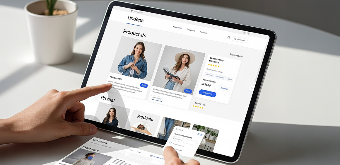
Streamline Product Discovery
Robust on-site search: Autocomplete, synonym recognition (“tee” = “t-shirt”), and typo tolerance.
Smart filters: Show only attributes relevant to the current category.
Hyper-clear empty states: If no results, suggest popular categories or a live-chat prompt.
Build High-Trust Product Pages
Above-the-fold essentials: Clear price, variant selector, primary CTA.
Visual depth: 3-D or 360° view for complex products; lifestyle imagery for context.
Micro-copy: Replace “Submit” with “Add to Cart — Ships in 24 h.”
Social proof: Highlight the most helpful reviews, not just the glowing ones.
Simplify Checkout to Three Steps or Fewer
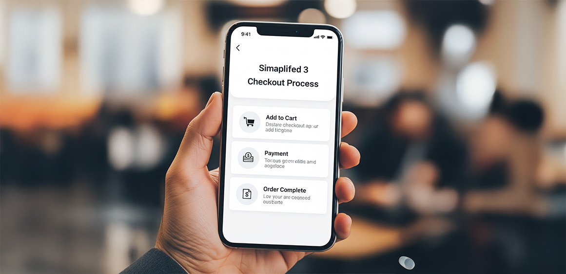
Cart Review – show shipping costs up front.
Address & Payment – enable guest checkout and digital wallets.
Confirmation – provide order summary, delivery estimate, and upsell add-ons
Offer Friction-Free Payment Options
Accept wallets (Apple Pay, Google Pay), BNPL, and local methods where you operate.
Display trust badges sparingly—one or two well-placed seals are enough.
Embed Clear Returns & Support Paths
Link to return policy directly in cart footers and order emails.
Use self-service return flows that generate labels instantly.
Add real-time order tracking to cut “Where is my package?” tickets.
Make Personalization Helpful, Not Creepy
First-time visitors: Show best-selling categories.
Returning customers: Recommend complementary items based on past purchases.
Cart abandoners: Trigger a polite reminder email within an hour; include thumbnail images so they instantly recall the product.
Ensure Accessibility & Inclusive Design
Follow WCAG 2.2 AA guidelines: sufficient contrast, focus states, aria-labels.
Caption all video content and provide alt text that describes function, not just appearance.
Test with keyboard-only navigation to catch hidden blockers.
Use Subtle Micro-Interactions
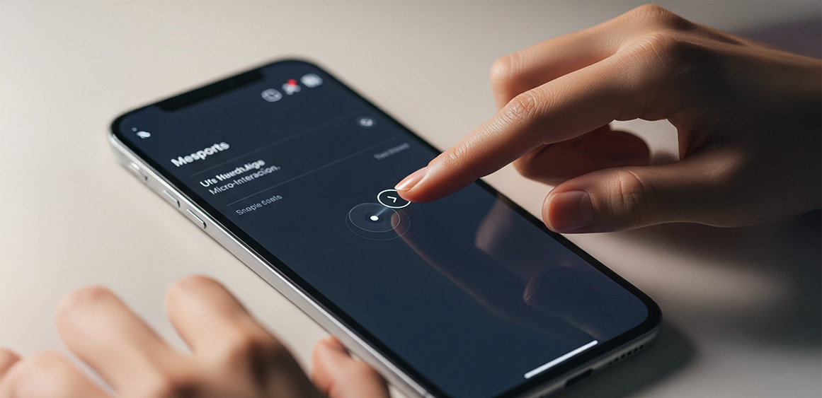
Animated “Add to Cart” confirmations that fade after 1-2 seconds.
Progress indicators during multi-step forms.
Hover zoom for desktop product galleries; pinch-to-zoom for mobile.
Validate Changes with Continuous Testing
Run A/B tests on headline copy, button colors, or layout shifts.
Track core metrics: add-to-cart rate, checkout completion, average order value (AOV).
Roll out winning variants gradually and keep an experiment backlog.
Conclusion
Great e-commerce UX isn’t a one-time redesign; it’s an ongoing cycle of simplifying, testing, and adapting to shopper behavior. By prioritizing speed, clarity, and trust—as outlined in these e-commerce UX best practices—you remove the roadblocks that keep customers from converting. Start with the lowest-effort fixes (image compression, guest checkout, clear CTAs), then iterate through deeper improvements like AI-powered search and personalized product grids. Small tweaks compound into big gains.
Need a second pair of eyes on your store? Fineart Design Agency can audit your current UX and deliver an action plan that lifts conversions in weeks, not months. Let’s chat about turning browsers into loyal buyers.
