

Introduction
Let’s be real — most websites today look kinda the same.
Smooth gradients. Rounded buttons. Predictable layouts. It’s clean, it’s safe… and it’s also forgettable.
But in 2025, two bold styles are shaking up that monotony: Neo-Brutalism and Glassmorphism. One’s loud, one’s sleek — and together, they’re redefining what “modern minimalism” looks like on the web.
Now, before you go slapping frosted panels over thick black text blocks, hold up. These are powerful visual tools, and if you don’t use them intentionally, you’ll end up with a mess that frustrates users more than it impresses them.
Here’s how to actually use Neo-Brutalism and Glassmorphism without wrecking your UX.
What Are We Dealing With?
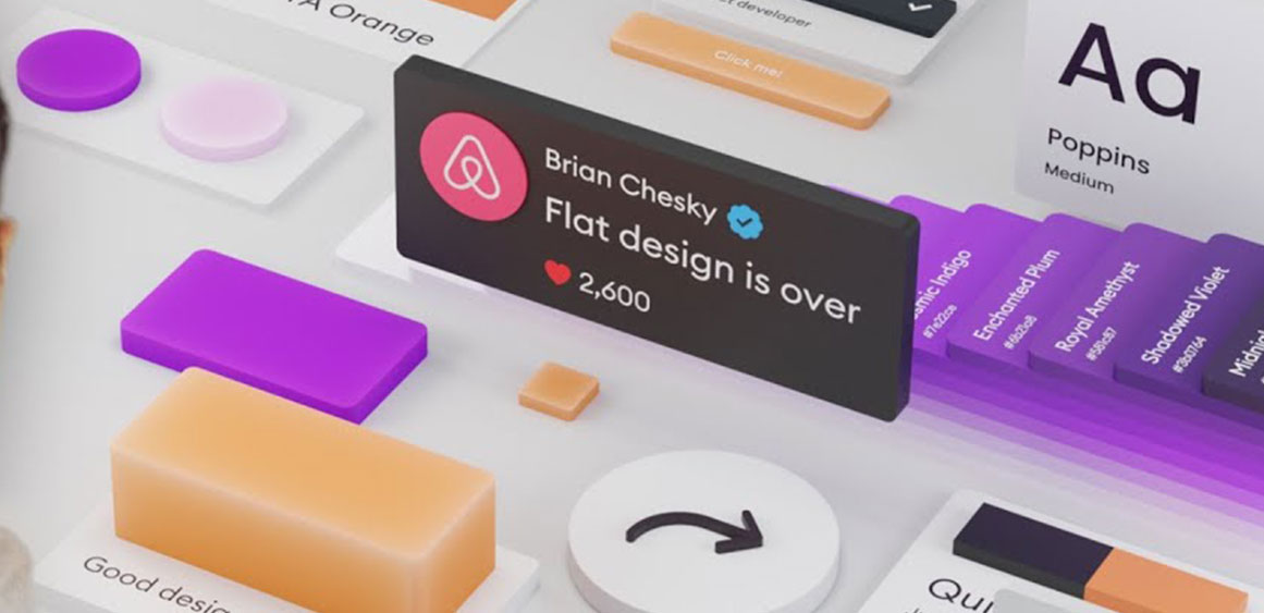
Neo-Brutalism
Think harsh lines, loud type, raw layouts. It’s a throwback to brutalist architecture and early web aesthetics — unapologetically in-your-face.
Big, bold type
Thick borders
Grid-heavy layouts
Little to no decoration
Glassmorphism
On the other end of the spectrum: soft, layered, see-through UI. This is the elegant older cousin of skeuomorphism, but cleaner and more abstract.
Frosted-glass effects
Background blurs
Translucent cards
Light gradients and shadows
Now imagine combining these two. It’s not as wild as it sounds.
Why Combine Them?
Because when done right, it works. You get:
Brutalism’s raw clarity and confidence
Glassmorphism’s modern, polished vibe
It’s contrast and tension — and that’s exactly what can make a digital experience memorable.
But here’s the catch: this isn’t just about style. If your site looks cool but feels confusing, people will bounce. Fast.
Let’s break down how to strike the right balance.
7 Tips to Make It Work
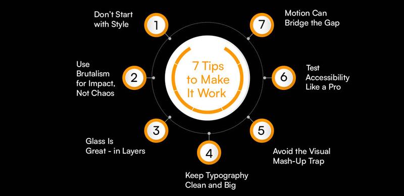
Don’t Start with Style
Start with structure. Map your UX. Get your wireframes solid. If the layout doesn’t work in grayscale, no amount of blur or bold type will save it.
Use Brutalism for Impact, Not Chaos
Brutalist design can anchor your UI — headlines, nav bars, CTAs. But don’t go full black-and-white terminal screen unless you’re coding 1996 nostalgia.
Use it for:
Attention-grabbing headlines
Section separators
Calls to action that pop
Glass Is Great — in Layers
Glassmorphism works best as a layer on top of something solid — not as the whole foundation. Use it to:
Soften modals or overlays
Make tooltips feel “hovered” in real life
Add depth without clutter
But be careful: blur-heavy designs tank performance on low-power devices.
Keep Typography Clean and Big
Both styles thrive on strong type, so don’t play it safe. Go bold with your headings. Pick a geometric sans-serif. Let your text breathe — and always test contrast.
Avoid the Visual Mash-Up Trap
The real danger? Mixing too many effects:
Glassmorphism + rainbow gradients + textured backgrounds = migraine.
Brutalism + unstyled elements + animations = chaos.
Pick a visual voice and commit. Let one style lead, and the other support.
Test Accessibility Like a Pro
Check your contrast. Don’t let white text float over a blurred background without enough clarity. Make sure your buttons are still recognizable, not abstract shapes behind glass.
Use:
Chrome’s Lighthouse tools
Manual testing with real users
Designing something edgy doesn’t mean leaving people behind.
Motion Can Bridge the Gap
Micro-interactions — hover effects, button ripples, subtle depth changes — can make the two styles talk to each other. It turns your UI into a conversation, not a shouting match.
Use Framer Motion, CSS transitions, or Lottie animations to layer in softness and response.
When to Use This Combo
This aesthetic isn’t for everyone. It shines when you want to stand out — portfolios, agencies, creative startups, or next-gen SaaS tools.
Not ideal for:
Legal sites
Government dashboards
Banking apps (unless you’re intentionally breaking conventions)
Think vibe-first brands, bold mission statements, and digital products trying to build vibe + trust.
Conclusion
Designing with Neo-Brutalism and Glassmorphism isn’t about chasing trends — it’s about finding the tension between contrast and clarity, depth and direction. You’re not just styling buttons or layering cards; you’re shaping how people feel and move through digital space.
When it works, it’s not just good UX.
It’s visual storytelling. It’s functional art.
That’s where an experienced design partner makes all the difference.
At Fineart Design Agency, we specialize in crafting interfaces that are bold, modern, and still laser-focused on usability. Whether you’re reimagining a brand, launching a digital product, or just trying to break the mold, our team knows how to bring visual innovation and user experience into balance.
You don’t have to choose between aesthetics and accessibility — we’ll help you have both.
