

Introduction

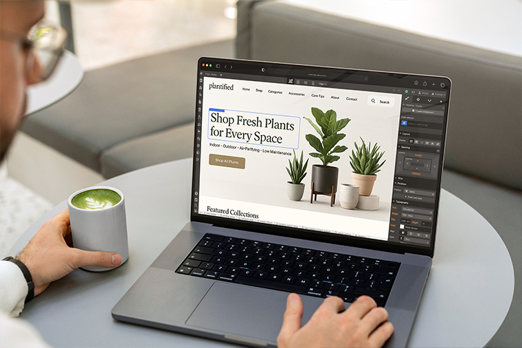
Accessibility isn’t a “nice to have.” It’s table stakes—for users with disabilities, older devices, low-bandwidth situations, and even distracted mobile visitors. This guide gives you a practical, Webflow-specific checklist mapped to core WCAG 2.2 success criteria. It focuses on the fixes designers can apply without heavy engineering: headings, landmarks, focus, and alt text—plus a few adjacent areas (contrast, forms, keyboard, media) that commonly fail audits.
Ground rules

WCAG target: Aim for WCAG 2.2 AA.
Principles (POUR): Perceivable, Operable, Understandable, Robust.
Design first, then wire: Bake accessibility into components and styles before you scale content.
Headings: clear structure and one H1 per page
Goal: Logical outline that screen readers and search engines can parse.
Checklist
Use one H1 per page (usually the page title or hero).
Nest headings semantically: H2 → H3 → H4 (don’t jump from H2 to H4).
Don’t style paragraphs to look like headings. Use real heading elements.
Keep heading text meaningful (no “Welcome” or vague “Learn more” as the only heading).
Avoid all-caps for long headings (hurts readability and letterforms).
Webflow how-to
Set heading elements (H1–H6) from the Add → Typography → Heading controls, not divs.
Create a Heading Style Guide page: demonstrate each heading level with sample copy.
For visual size changes, adjust CSS classes, not the semantic level.
Landmarks: give pages a map (header, nav, main, aside, footer)
Goal: Let assistive tech jump between the major regions of a page.
Checklist
Wrap top bar in a <header> (one per page ideally).
Use <nav> for primary/secondary navigation.
Wrap your main content in <main> (one per page, unique).
Use <aside> for sidebars or complementary content.
Use <footer> for global or section footers.
Avoid landmark duplication (e.g., multiple mains). If you have multiple navs, label them.
Webflow how-to
In the Element Settings panel, set Tag for your wrappers: header, nav, main, aside, footer.
For multiple navs, add ARIA labels (e.g., aria-label=”Secondary navigation”).
Add a skip-to-content link (see code below).
Skip link (add once in your global symbol)
<a class=”skip-link” href=”#main”>Skip to main content</a>
.skip-link {
position:absolute; left:-999px; top:auto; width:1px; height:1px; overflow:hidden;
}
.skip-link:focus {
left:16px; top:16px; width:auto; height:auto; padding:8px 12px; background:#fff; outline:2px solid; z-index:9999;
}
Focus: visible, logical, keyboard-friendly
Goal: Users navigating with a keyboard must see where they are and move predictably.
Checklist
Never remove focus outlines. Style them to match your brand if needed.
Set a 2–3 px focus ring with good contrast around interactive elements.
Tab order follows the visual flow (left-to-right, top-to-bottom).
No keyboard traps (e.g., modals that don’t allow Esc/tab out).
Components that open (menus, accordions) should toggle with Enter/Space and close with Esc.
Webflow how-to
Create a global .focus-ring utility and apply via :focus-visible where supported:
:focus-visible { outline: 3px solid #0A84FF; outline-offset: 2px; }
For modals/menus, use Webflow Interactions plus these behaviors:
Set focus to the first focusable element when opening.
Return focus to the trigger when closing.
Close on Esc (tiny custom JS if needed).
Remove tabindex=”-1″ from interactive elements (it makes them unreachable). Use tabindex=”-1″ only on non-interactive containers for programmatic focus targets (e.g., skip link destination).
Alt text: meaningful, concise, and decorative where appropriate
Goal: Communicate essential information conveyed by images.
Checklist
Informational images: Provide concise alt text (what the image does, not just what it is).
Decorative images/backgrounds: Use empty alt (alt=””) or CSS backgrounds; don’t announce noise.
Icons paired with text: Often alt=”” is fine if the label already conveys meaning.
Images as links: Alt should state the destination or action (“Download annual report PDF”).
Avoid keyword stuffing; keep to ~125 characters when possible.
Webflow how-to
For images in the CMS, set alt from a CMS field (so editors don’t forget).
For purely decorative images inside the Designer, set alt=””.
Avoid text baked into images; use real text for headlines and buttons.
Color & contrast: readable under real conditions
Goal: Text and UI must be legible for low-vision users and in poor lighting.
Checklist
Text contrast meets AA:
Normal text: 4.5:1
Large text (≥18pt regular / 14pt bold): 3:1
Non-text UI elements (icons, active indicators) meet 3:1 against adjacent colors.
Don’t rely on color alone to convey meaning (add icons, patterns, text).
Webflow how-to
Define color tokens (variables) and test each against typical backgrounds.
Build a contrast matrix component in your style guide to validate brand combos.
Forms: labels, errors, and help text that actually help
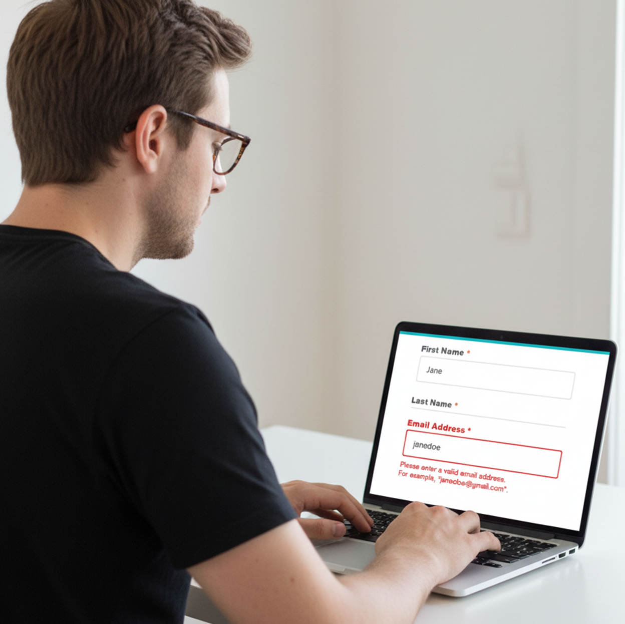
Goal: Anyone can complete your forms via keyboard or screen reader.
Checklist
Every input has a visible label (not just placeholders).
Associate labels with inputs (for SRs) and include required indicators.
Provide inline error messages tied to the field and a summary at submit if possible.
Use helpful instructions and examples (date, phone formats).
Ensure submit buttons are reachable and announce success/failure.
Webflow how-to
Use Webflow’s Label element, not placeholder-only.
Add aria-describedby from inputs to their help/error text IDs for announcements.
Keep error red accessible (contrast ≥ 4.5:1 vs background).
Keyboard interactions: menus, tabs, accordions
Goal: Everything clickable is operable via keyboard.
Checklist
Links/Buttons: Activate with Enter/Space.
Menus/Tabs/Accordions: Arrow keys cycle options; Esc closes popovers.
Focus stays inside open dialogs; returns to trigger on close.
Don’t use non-interactive elements (div, span) as buttons.
Webflow how-to
Use Button or Link Block elements for interactive controls.
If you must use custom elements, add role and keyboard handlers (short JS).
Media: captions, transcripts, reduced motion
Goal: Multimedia content is perceivable and comfortable.
Checklist
Videos: Provide captions; offer transcripts for long-form media.
Autoplay off by default; if used, muted and controllable.
Respect prefers-reduced-motion for heavy animations/parallax.
Webflow how-to
Host videos with caption support (e.g., YouTube/Vimeo with captions enabled) or embed your own VTT.
Wrap motion-heavy sections in a class and gate with:
@media (prefers-reduced-motion: reduce) {
.big-motion { animation: none !important; transition: none !important; }
}
Tables & lists: structure, not decoration
Goal: Data is navigable and announced correctly.
Checklist
Use real tables for data (not grids of divs).
Define a <caption> if helpful.
Mark header cells with <th scope=”col/row”>.
Use ordered/unordered lists for sets of items or steps.
Webflow how-to
If tables are rare, embed minimal HTML via Embed.
For lists, use Webflow’s List elements, not stacked paragraphs.
Language, links, and readability
Goal: Content is understandable and correctly announced.
Checklist
Set page language (lang=”en” or your locale).
Use descriptive link text (“Download brand guidelines”) instead of “Click here.”
Aim for plain, scannable language, short sentences, and clear headings.
Mark acronyms on first use; avoid jargon where possible.
Webflow how-to
Set language in Page Settings → Custom Attributes (lang).
Standardize link copy in your content guidelines CMS item.
Quick QA workflow
Keyboard-only pass: Can you reach everything? See focus? Close modals?
Screen reader spot check: NVDA/VoiceOver: headings outline, landmarks, link names, form errors.
Contrast audit: Run a quick pass on hero, buttons, text on images.
Mobile check: Zoom to 200–400%. Does layout reflow? Are targets big enough (≥ 44×44 px)?
Regression safety: Recheck components edited in this release.
Tools to use
Wave, Axe DevTools, Lighthouse, NVDA/VoiceOver, Color Contrast Analyzers.
Keep a “Known Issues” note and fix high-impact items first.
Using the Relume Library to Ensure Accessibility in Webflow
Relume Library is a collection of pre-designed, ready-to-use components for Webflow, built with accessibility in mind. These components are not only visually stunning but also optimized to meet WCAG standards, ensuring your website is inclusive and usable by people with disabilities. With Relume, achieving accessibility compliance becomes an effortless part of your design process.
WCAG-Compliant Components: Pre-built components in the library are designed to meet WCAG 2.1 accessibility guidelines, ensuring compliance without extra effort.
Semantic HTML: Components are built using proper semantic HTML tags, which helps screen readers interpret content correctly for visually impaired users.
ARIA Attributes: The library includes essential ARIA (Accessible Rich Internet Applications) attributes, providing additional context for users relying on assistive technologies.
Keyboard Navigation Support: All interactive elements are focusable and navigable using the keyboard, ensuring that users who cannot use a mouse can still access the full functionality of the site.
Alt Text for Images: Images and other non-text content come with pre-filled alt text fields, ensuring that visually impaired users get context via screen readers.
Color Contrast: The library ensures sufficient color contrast, improving readability for users with low vision or color blindness.
Responsive and Mobile-Friendly: The components are designed to be fully responsive, which helps ensure accessibility on a variety of devices, including mobile phones.
Copy-paste acceptance criteria
Page has 1× H1; headings are hierarchical; no styled paragraphs as headings.
Landmarks set (header, nav, main, footer); skip link present and working.
All interactive elements have a visible focus state; tab order is logical.
No keyboard traps; modals/menus close with Esc and restore focus.
All images have appropriate alt (or alt=”” if decorative).
Contrast: text ≥ 4.5:1 (normal), 3:1 (large); UI icons ≥ 3:1.
Forms: labels, inline errors, and helpful instructions.
Motion respects prefers-reduced-motion; no autoplaying audio.
Language attribute set; links are descriptive.
Conclusion
Build a Style Guide page with headings, links, buttons, alerts, forms, and examples of good/bad alt text.
Turn this checklist into a Webflow Checklist CMS so editors can self-audit before publishing.
Aim for consistent patterns: once you solve focus, skip links, and headings in your global components, every page benefits.
Need a done-for-you setup? Fineart Design Agency specializes in Webflow—design systems, variables, components, CMS governance, and accessibility hardening. We can convert this guide into a Webflow-ready Accessibility Checklist page (template + components, skip link, styled focus ring, contrast tokens) and wire it into your CMS so your team can drop it straight into your site and keep shipping accessibly
