

Introduction
In today’s multi-device world, your website needs to look sharp on a laptop, load fast on a phone, and work everywhere in between. Why? Because users expect it. And so does Google.
Poor mobile experience? Users bounce.
Fixed-width desktop layouts? Lost conversions.
Unclear navigation on tablets? Missed opportunities.
This isn’t just a design problem—it’s a business risk.
Here’s how to make sure your website not only looks good on every screen but also performs well across them—with clear takeaways you can apply right away.
Design Mobile-First, But Think User-First
Mobile-first isn’t just a buzzword—it’s a design philosophy. But even more important is user-first design.
Start with what your mobile user needs (fewer distractions, faster access).
Strip out the non-essentials.
Build upward—adding enhancements for tablets and desktops only when needed.
Business tip: Google now indexes mobile versions of websites first. If your mobile site is broken or slow, your ranking (and traffic) will suffer.
Use Flexible Grids, Not Fixed Layouts
A responsive layout isn’t just about scaling—it’s about reflowing content smartly across breakpoints.
Use CSS Grid or Flexbox for flexibility
Design for content priority, not just visual balance
Avoid fixed pixel widths—opt for %, em, or rem units
Test it: Collapse your browser screen. If your content overlaps, disappears, or breaks layout—it’s time to rework your structure.
Adapt Typography Dynamically
Typography needs to scale with screen size—but not just shrink.
Use fluid typography (clamp() in CSS is amazing)
Maintain readability at all sizes (16px minimum on mobile)
Adjust line height and spacing for clarity
Why it matters: Text is the most consumed content on most websites. Poor readability = higher bounce rate = fewer conversions.
Design Touch-First Interactions for Mobile

Taps, not clicks. Swipes, not hovers.
Buttons should be large enough (44px minimum tap area)
Use visual feedback (button state changes on tap)
Avoid hover-only menus—they don’t work on mobile
Pro insight: Use device detection to swap hover effects with alternatives like tap-to-expand on mobile.
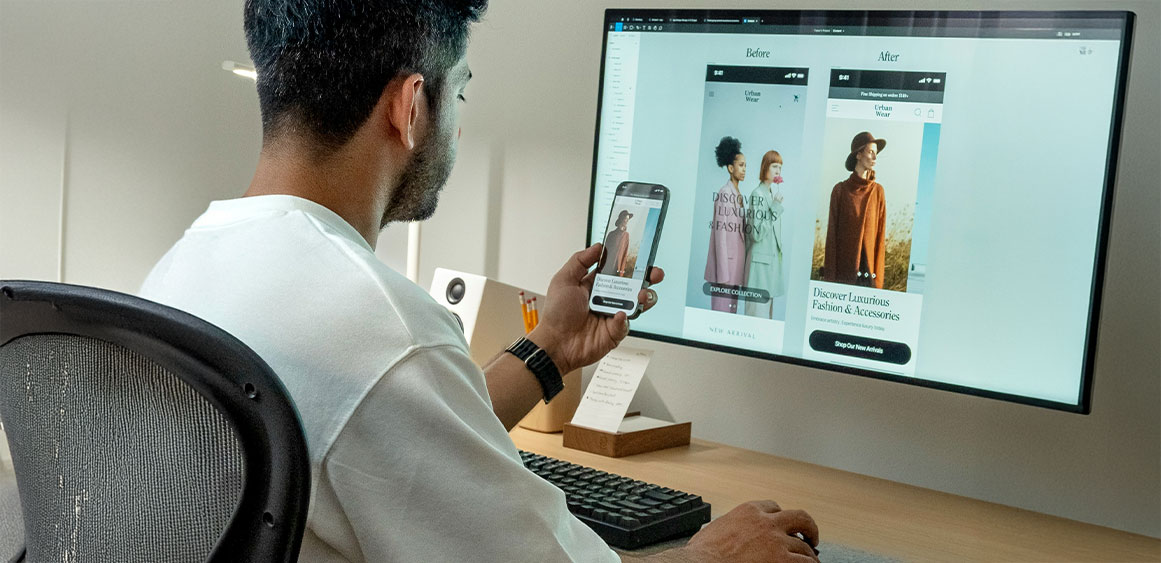
Serve Responsive Images Without Killing Load Time
Images are visual assets—but also performance hazards.
Use srcset to load the right size image per device
Convert heavy PNGs to WebP or AVIF
Lazy-load images below the fold to improve time-to-first-paint
Speed tip: 53% of mobile visitors leave if a page takes longer than 3 seconds to load.
Redesign Navigation for Small Screens
Mega menus and long nav bars often break on mobile.
Solutions:
Collapse nav into a hamburger menu or bottom tab bar
Keep top actions like “Contact” or “Buy Now” visible
Use off-canvas menus that slide in for better space control
Stat to know: Confusing navigation is one of the top reasons users abandon mobile websites.
Test Across Real Devices (Not Just Emulators)

Emulators ≠ reality.
Test on iOS and Android
Check portrait and landscape views
Try it on low-end phones with slow connections
Checklist: Touch targets, button responsiveness, image loading, input forms, tap-to-call functionality.
Use tools like:
- Actual device testing (always best)
Build Around Context, Not Just Screen Size
Design isn’t just about pixels—it’s about user context.
Mobile users might be in a hurry or multitasking
Desktop users might be comparing data or multitasking
Tablet users might be browsing casually or presenting
Adapt content accordingly. For instance, simplify forms on mobile but show more data tables on desktop.
Don’t Just Be Responsive—Be Responsible
Responsive web design is table stakes in 2025. What makes you stand out is performance, clarity, and intent.
Ask yourself:
Does my website guide users or confuse them?
Does it feel snappy on all devices?
Are we just resizing things—or designing with purpose?
When you put the user at the center and use data to guide design, you don’t just build a responsive site. You build a reliable experience.
Final Thoughts: Why This Matters Now More Than Ever
A website that doesn’t adapt to every screen size and device is a silent killer—it turns users away without you even noticing.
If your audience lands on a clunky, unreadable mobile layout, they’re gone. And they probably won’t come back.
But when your site feels like it just works—clean, fast, easy to use—it builds trust. It drives action. And it brings people back.
That’s what we do at Fineart Design Agency.
We help businesses go beyond just “looking good” and deliver digital experiences that work beautifully everywhere—on any screen, for any user.
