

Introduction
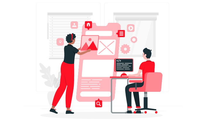
In today’s digital age, it’s more important than ever to have a website that looks great and functions well on all devices. That’s where responsive web design comes in. Responsive web design (RWD) is an approach to web design that makes your website look and work well on any device, whether it’s a desktop computer, a laptop, a tablet, or a smartphone.
What is Responsive Web Design?

Responsive web design is a term used to describe a website that is designed to work well on multiple devices and screen sizes. In other words, it is a way to make sure that your website looks good and functions properly no matter what device someone is using to view it. Responsive web design is an approach to site development that allows for optimal viewing and interaction experiences across a wide range of devices. A traditional website can be difficult to view on a small screen and may require users to zoom in and out or scroll horizontally to see all the content. A responsive website, on the other hand, will automatically adjust its layout according to the size of the screen it’s being viewed on, making it much easier (and more pleasant) for users to navigate. This is accomplished through a combination of flexible grids and layouts, images, and typography.
The need for responsive design has arisen from the increasing popularity of mobile devices. More and more people are using their phones and tablets to go online, and if a website isn’t designed to work well on these smaller screens, it can be difficult or even impossible to use. Responsive web design is achieved through a combination of techniques, including using fluid layouts, media queries, and breakpoints.
Fluid layouts are ones that resize themselves to fit the width of the screen they’re being viewed on. This is accomplished by using percentages instead of fixed pixel values for things like widths and heights.
Media queries are a way to target specific styles at specific device sizes. For example, you could use a media query to make sure that certain font sizes only appear on devices with a screen width of 768px or less.
Breakpoints are points at which your layout will change to better suit the size of the screen. For example, you might have one column on a phone-sized screen and two columns on a tablet-sized screen. Using these techniques together, you can create a website that looks and works well on any device. There are a few things to keep in mind when designing a responsive website. First, you need to make sure that your content is accessible on all devices. This means using clear and concise text, as well as easy-to-use navigation.
Second, you need to consider the different ways people will be accessing your site. Some people will be using a desktop computer, while others will be using a mobile device. Make sure your site can be used and navigated easily no matter how it’s being accessed. And finally, you need to test your site on multiple devices to make sure it looks and works the way you want it to. This can be a time-consuming process, but it’s important to make sure your site is accessible and easy to use for everyone.
User Experience Matters
A responsive website provides an optimal viewing experience – easy reading and navigation with a minimum of resizing, panning, and scrolling – across a wide range of devices, from desktop computer monitors to mobile phones. This is important because, according to Google, nearly 60% of internet users are likely to abandon a website if it doesn’t load properly on their device. In other words, if your site isn’t responsive, you’re likely losing out on a significant number of potential customers.
In addition, user experience goes beyond simply being able to view your website on different devices. A good user experience takes into account factors such as load time, intuitive navigation, and overall design. A responsive website ticks all of these boxes, providing users with a seamless experience no matter what device they’re using.
So, why is responsive design so important?
There are a few key reasons:
Google Prefers Responsive Websites: Google has stated that responsive design is its recommended mobile configuration, and even goes so far as to call responsive design the industry’s best practice. In other words, if you want to please Google – and who doesn’t? – a responsive website is the way to go.
Improved User Experience Across Devices: As we’ve already mentioned, one of the main benefits of responsive design is improved user experience. By providing users with a consistent experience no matter what device they’re using, you’re more likely to keep them engaged with your site. And keeping users engaged is critical for any business that wants to succeed online.
Increased Traffic and conversions: A responsive website is not only more user-friendly – it’s also more search engine friendly. And when your site is more search engine friendly, you’re likely to see an increase in traffic and conversions.
Lower Maintenance Costs: Another benefit of responsive design is that it can save you money in the long run. With a traditional website, you would need to create and maintain separate mobile and desktop versions of your site. This can be time-consuming and expensive. With a responsive website, you only have to create and maintain one version of your site, which can save you both time and money.
Future-Proofed: With the number of people using mobile devices to access the internet only increasing, it’s important to make sure your website is able to meet their needs. And the best way to do that is with a responsive website.
Responsive design is critical for any business that wants to succeed online. By creating a responsive website, you’re improving your user experience, increasing your traffic and conversions, and future-proofing your business. So what are you waiting for? Start planning your responsive website today!
SEO Suffers Without Responsiveness

SEO is the practice of optimizing a website for Google search with the goal of earning higher web traffic levels and improving the visibility of the site. A major factor that affects SEO is known as responsive web design or RWD. This term refers to websites that are designed to function well on multiple devices, from desktop computers to tablets to mobile phones.
RWD is important for SEO because it can help to improve the visibility of a website on Google search. When a website is designed responsively, it means that the site will adjust its layout and content to fit the screen size of the device that is being used to view it. This can help to make sure that your website is visible and easy to read on all devices, which can improve your ranking on Google search.
Moreover to responsive web design, there are other factors that can affect your SEO. These include things like the quality of your content, the structure of your website, and the way that you promote your site. However, by making sure that your site is designed responsively, you can help to improve your SEO and get your website seen by more people.
In addition to impacting the user experience, not having a responsive website can also hurt your SEO efforts. Google has stated that responsiveness is a ranking factor, which means that non-responsive websites are at a disadvantage when it comes to organic search traffic. In other words, even if you have great content and an impressive backlink profile, your website won’t rank as high as it could if it isn’t responsive.
How to Implement Responsive Web Design

If you’re unsure how to implement responsive web design on your website, don’t worry – you’re not alone. Luckily, there are a few easy ways to make your site responsive. In this article, we’ll show you how to implement responsive web design using two methods: media queries and responsive design frameworks. First, let’s talk about media queries. Media queries are a CSS3 feature that allows you to target styles based on specific conditions, such as the width of the browser window. For example, you could use a media query to only apply certain styles if the width of the browser window is less than 600px wide. This would be useful if you wanted to create a mobile-specific stylesheet that only applies to small screens.
To use media queries, you’ll need to add a few lines of CSS to your existing stylesheet:
/* Target small screens */@media only screen, (max-width: 600px) and {/* Styles */}.
You can add as many media queries as you like, targeting different screen sizes and devices. Now let’s talk about responsive design frameworks. A responsive design framework is a pre-built set of CSS code that makes it easy to create responsive websites. There are a few different frameworks to choose from, but we recommend using Bootstrap, Foundation, or Skeleton. These frameworks are all open source and free to use. Once you’ve chosen a framework, you’ll need to include the CSS file in your website’s HTML code:/* Include the responsive design framework */.
If you’re unsure how to implement responsive web design, we recommend using a responsive design framework. This will make it easy to create responsive websites without having to write any CSS code. Which method do you prefer? Let us know in the comments!
Conclusion
As you can see, responsive web design is critical for any company that wants to succeed in the digital age. If you haven’t made your website responsive yet, now is the time to do so. Not only will it improve the user experience for your visitors, but it will also give you a boost in the search rankings. And what’s not to love about that?
